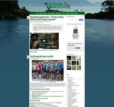
There’s been a few changes around the website recently and I just wanted to officially announce the redesign of the site. Soo… yeah.. its official. The design is new.
It was time to change things up a bit and I settled on a new mobile-repsonsive theme that I think is fairly clean and easy to navigate. ‘Mobile-repsonsive’ is just fancy geek-talk meaning it can easily be displayed on a mobile-device and the website will resize itself to fit your screen, no matter how teeny-tiny it may be! If you’re on a PC, you can even try shrinking your browser right now to see it in action. Go ahead. Take that cursor and drag the screen smaller… oh there goes the background and sidebar. And now the navigation bar is a drop-down menu! … the images are shrinking!!! And it all happens automagically.
That was exciting.
Also, I bucked up and got a fancy new logo for the site. I posted a bunch of logo options on here and Facebook and Twitter, and the design you see was the heavy favorite. Thanks to everyone who pitched in with an opinion. I owe an extra thanks to @uxendorphins, @cmall and @jpelletier who I bugged a lot for opinions. A lot of people weighed-in and I would have chose a different logo than this one, so thanks to everyone for the feedback. And also thanks my buddy @robbiedrizzle who made the old logo for me on a whim. It served well, but it was time to go. So here’s the new one:
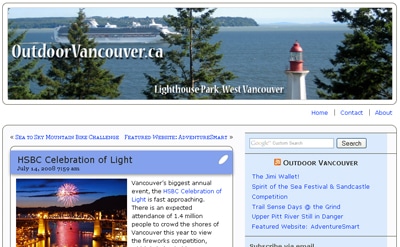
I started this site over 5 years ago on Blogspot. Sadly, I don’t have a screenshot of what it looked like back then, but trust me, it was crude. When I moved to a self-hosted site it looked like this:
I love that it had 3 whole pages – ‘Home’, ‘Contact’ and ‘About’. Then last year the site was revamped to look like this:
And now it looks as you see it. I’m still tweaking, so if you’re not keen on the colors or think anything is missing, I’m always happy for feedback, just drop a comment below!


Jeff
Nice choice, looks great! Glad I could help.